MIRA 2.0
Making a model's recommendation arguable
MIRA recommends operating changes in a molybdenum leach circuit. After on-site research, I designed a review flow that shows operators the forecast, current setting, and consequence of accepting, adjusting, or rejecting each recommendation.
⟦Ŕëšüľţ ·⟧
Delivered recommendation review, history, and blend-calculator designs that make forecasts, data recency, and operator choices visible. Data science and engineering owned the model and infrastructure.
~20%
lower recommended fresh-ferric addition than the legacy bleed calculator
Monitored seven-day comparison, internal tracking.
- ⟦Ÿëáŕ ·⟧
- 2024–25
- ⟦Ḿÿ šçöþë · ·⟧
- Designed the operator-facing experience and information architecture; conducted on-site research at the plant. Data science and engineering owned the model and infrastructure.
- ⟦Çöľľáƀöŕáţöŕš · ·⟧
- Product team with data scientists, cloud engineers, plant metallurgists, and operations staff.
A recommendation operators cannot challenge gets ignored
MIRA predicts impurity concentrations in the molybdenum leach circuit at Sierrita, outside Tucson, and recommends changes to throughput, fresh ferric addition, decant bleed, and digester runs. The open question was whether an operator on shift would act on it.
Operators already had a legacy bleed calculator and years of judgment. A screen that prints a number and offers a green button would ask them to replace both with blind trust. The design problem was to make the prediction arguable: show what the model expects under the recommendation, what it expects under the current setting, and where both sit against the spec limit.
The interface's job was not to be believed. It was to be verified.
On-site, October 2024
I spent a day at the plant with operators and metallurgists. Two findings changed the structure of the product.
The first is that assays lag. Lab results arrive hours after the material they describe, so every recommendation rests on a slightly stale picture, and everyone on the floor already knows it. The second is that the decision is not made by one person at one moment. It crosses a shift handoff, and the person who acts is frequently not the person who reviewed.
Neither is visible from a model output or a stakeholder workshop. Both became structural. Data recency is printed on the home screen rather than implied. Any calculator run can be shared by URL or locked in as the committed strategy, with an author and timestamp attached, because the decision has to survive a shift handoff even when the reviewer changes.
The screen the product exists for
Review is a five-step flow with one recommendation type per step. This gives each operating decision its own forecast and controls, so operators can inspect the consequence before moving to the next recommendation.
On the fresh-ferric step, six impurity elements are drawn as small multiples on one shared axis under one shared spec line. Solid to the left of today, dashed to the right, which encodes the actual-to-forecast boundary with no legend to look up. The recommended setting and the current setting are both forecast, in two colors, on the same chart. When the current setting breaks spec and the recommendation does not, that reads as a shape before it reads as a number.
The interface offers three choices: accept the recommendation at its setpoint, adjust to a custom value, or reject and keep the current setting. Both setpoints are printed on the buttons, so the consequence of disagreeing is as legible as the consequence of agreeing. A metallurgist who wants to investigate rather than act can expand any chart or switch it to a table.
Trust as a first-class metric
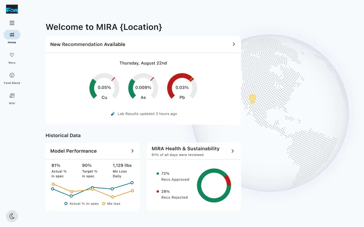
The home screen carries two figures most ML products keep in a status deck: the share of recommendations operators approved, and the share of days anyone reviewed at all. Publishing a model's rejection rate to the people accountable for acting on it is uncomfortable and useful. A model nobody reviews is not a model in production; it is a model in a database.
The blend calculator's results screen follows the same instinct in reverse. It leads with the constraint violation: the number of days beyond target in red, above every positive number on the page. Then it shows the arithmetic underneath so the result can be checked rather than accepted.
What the evidence supports
Over one monitored week, internal tracking put MIRA-recommended fresh-ferric addition roughly 20% below what the legacy bleed calculator would have called for. The team's note said savings still needed month-by-month validation, so this site does not convert that comparison into an annual or dollar claim.
The home screen and blend calculator do not share the same chrome. The design system caught up mid-project, and I chose not to rework a surface already in use by people on shift. I would unify them now.
◆⟦Đëçïšïöñš · ·⟧
⟦Ţĥë đëçïšïöñ · ·⟧
Make reject a full third option with its numeric consequence printed on it, rather than accept-or-dismiss.
⟦Ţĥë ţŕáđëöƒƒ · ·⟧
A third action requires a distinct recorded state and clear confirmation of the retained setting. It also makes disagreement visible alongside approval, which complicates a simple adoption narrative.
⟦Ţĥë çöñšëqüëñçë · · ·⟧
Operators can record disagreement with a specific recommendation while retaining the current setting. The review history distinguishes that choice from a recommendation that was never reviewed.
⟦Ţĥë đëçïšïöñ · ·⟧
Put six elements on one shared axis under one shared spec line, instead of six independently scaled charts.
⟦Ţĥë ţŕáđëöƒƒ · ·⟧
Elements with small absolute ranges get flattened and lose exactly the resolution a metallurgist wants. Covering that cost a per-chart expand and a chart-to-table toggle, both of which are extra surface to build, test, and maintain.
⟦Ţĥë çöñšëqüëñçë · · ·⟧
A consistent scale and spec line make breaches easier to scan across elements. Expanded charts and table views preserve a route to precise values.
⟦Ţĥë đëçïšïöñ · ·⟧
Print the model's rejection rate and the staleness of the lab data on the operator home screen.
⟦Ţĥë ţŕáđëöƒƒ · ·⟧
Data lag and low approval can reduce confidence in a recommendation. Making them visible requires the interface to support scrutiny as well as action.
⟦Ţĥë çöñšëqüëñçë · · ·⟧
Review coverage became a tracked number rather than an assumption, and assay lag became a stated property of the system instead of an implicit limitation. The interface could not fix the lag, but it could make it visible.
Data visualizationMachine learningField researchInformation design
◇⟦Áŕţïƒáçţš · ·⟧
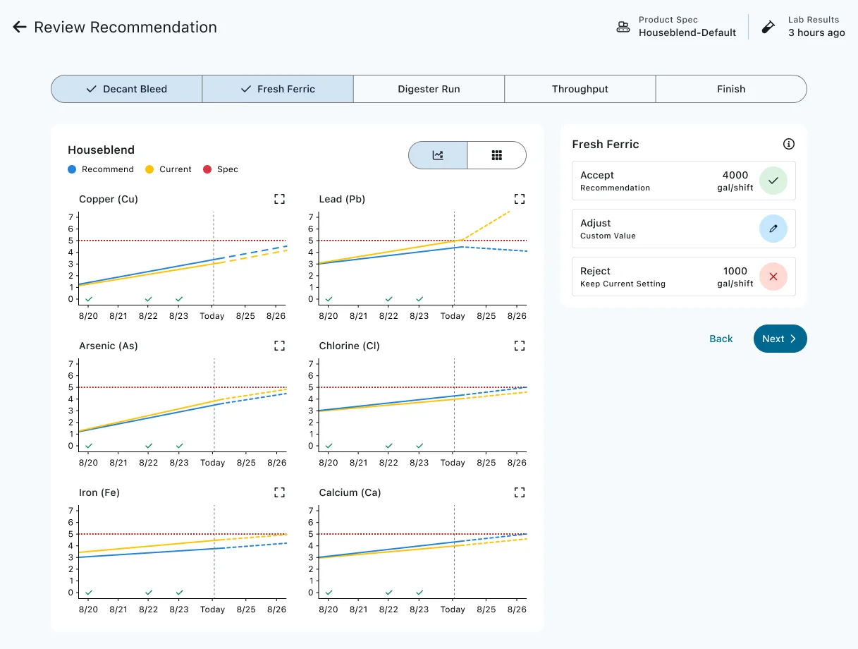
Step two of the recommendation wizard. Six impurities are forecast on a shared axis against one spec line, and the accept, adjust, and reject actions each show the setpoint they would produce.⟦Öþëñ ƒüľľ-šïžë ïḿáĝë · · ·⟧ 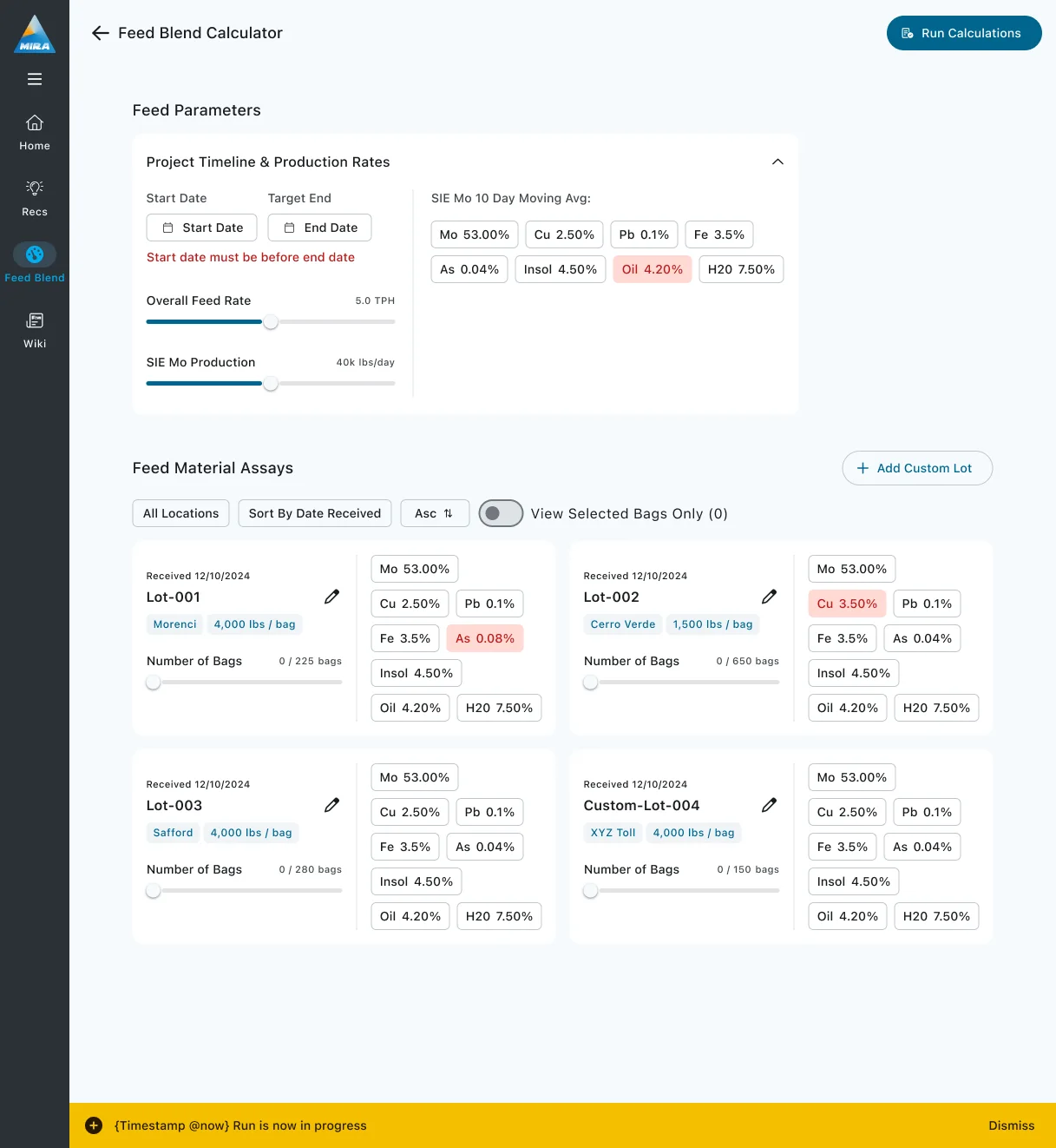
The feed blend input screen, pairing every candidate lot's selection slider with the assay chips needed to choose it, captured with a validation error, an active filter, and a job toast all live.⟦Öþëñ ƒüľľ-šïžë ïḿáĝë · · ·⟧ 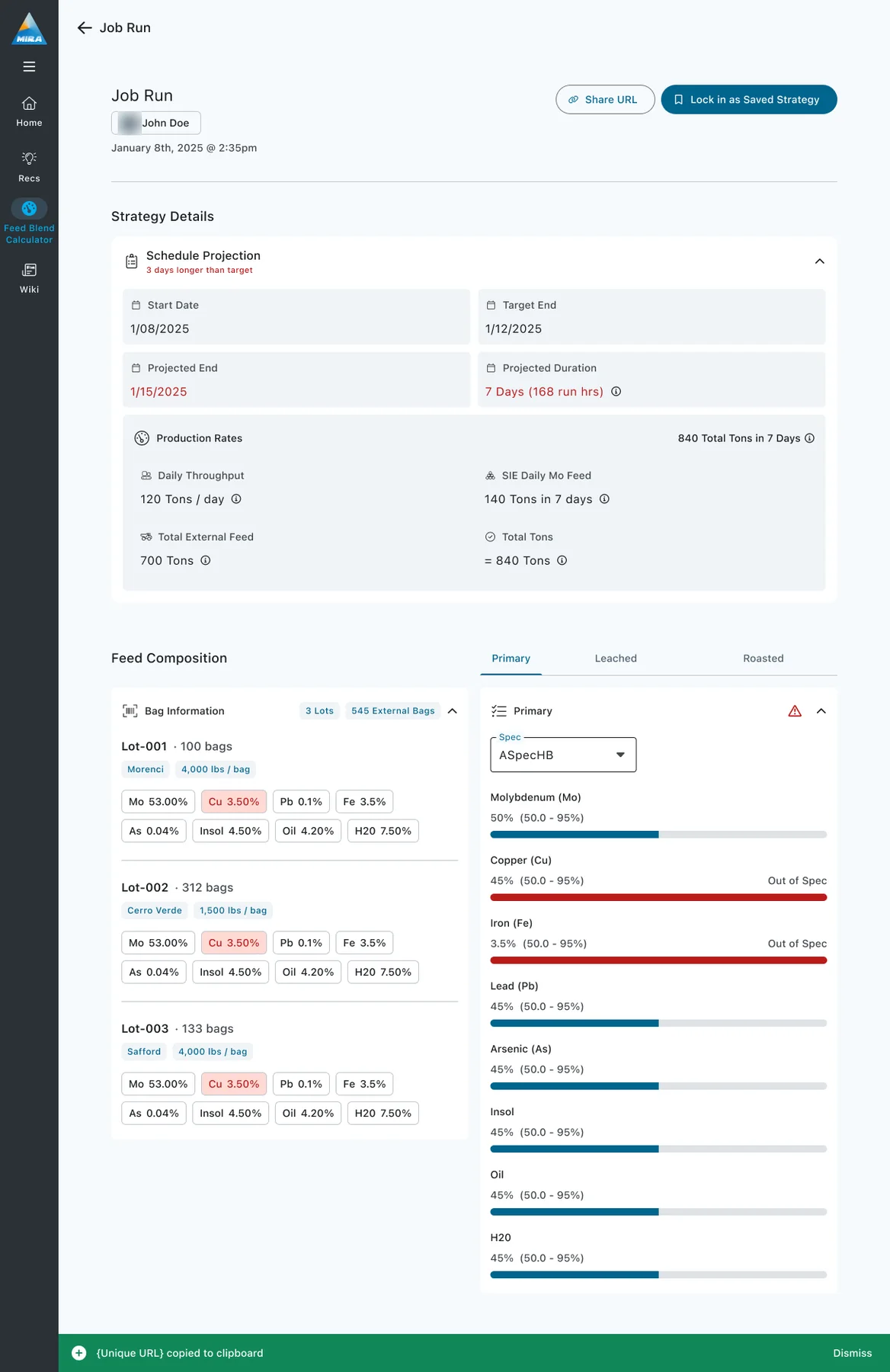
The job run result, leading with the schedule overrun before the production arithmetic, then eight range-bounded compliance meters that each state an in or out of spec verdict.A photographic avatar on the attribution chip is blurred.⟦Öþëñ ƒüľľ-šïžë ïḿáĝë · · ·⟧