Tribal Finance / DeFi & crypto
Tribal Finance: connecting brand and product
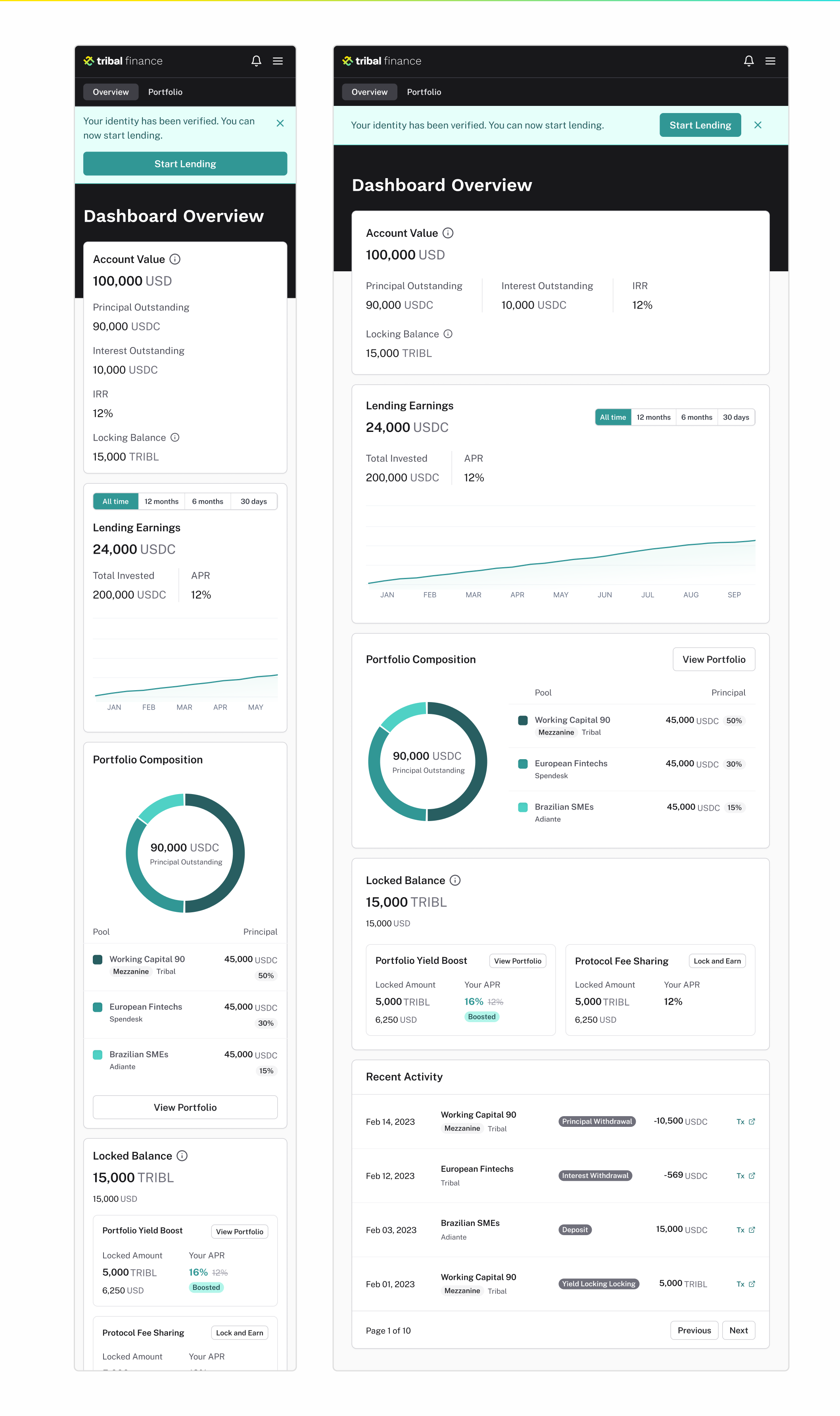
Tribal Finance brought together a multifaceted DeFi product and the marketing that introduced it. I worked with the team to align these efforts around users, a shared visual language, and clear product experiences.
Result
Helped connect the brand identity, marketing site, and product interface through shared design standards and working processes.
- Year
- 2020–23
- My scope
- I supported product design over three years, working with the team on brand and marketing strategy, design-system creation and implementation, and the DeFi product experience.
A shared language for brand and product
The challenge was to align the team around a user-centered, product-focused approach while developing the brand. I helped establish processes that connected design decisions with marketing strategy.
The identity treatments show a consistent wordmark across light and dark backgrounds, providing a recognizable starting point for the product and marketing surfaces.

Making component states explicit
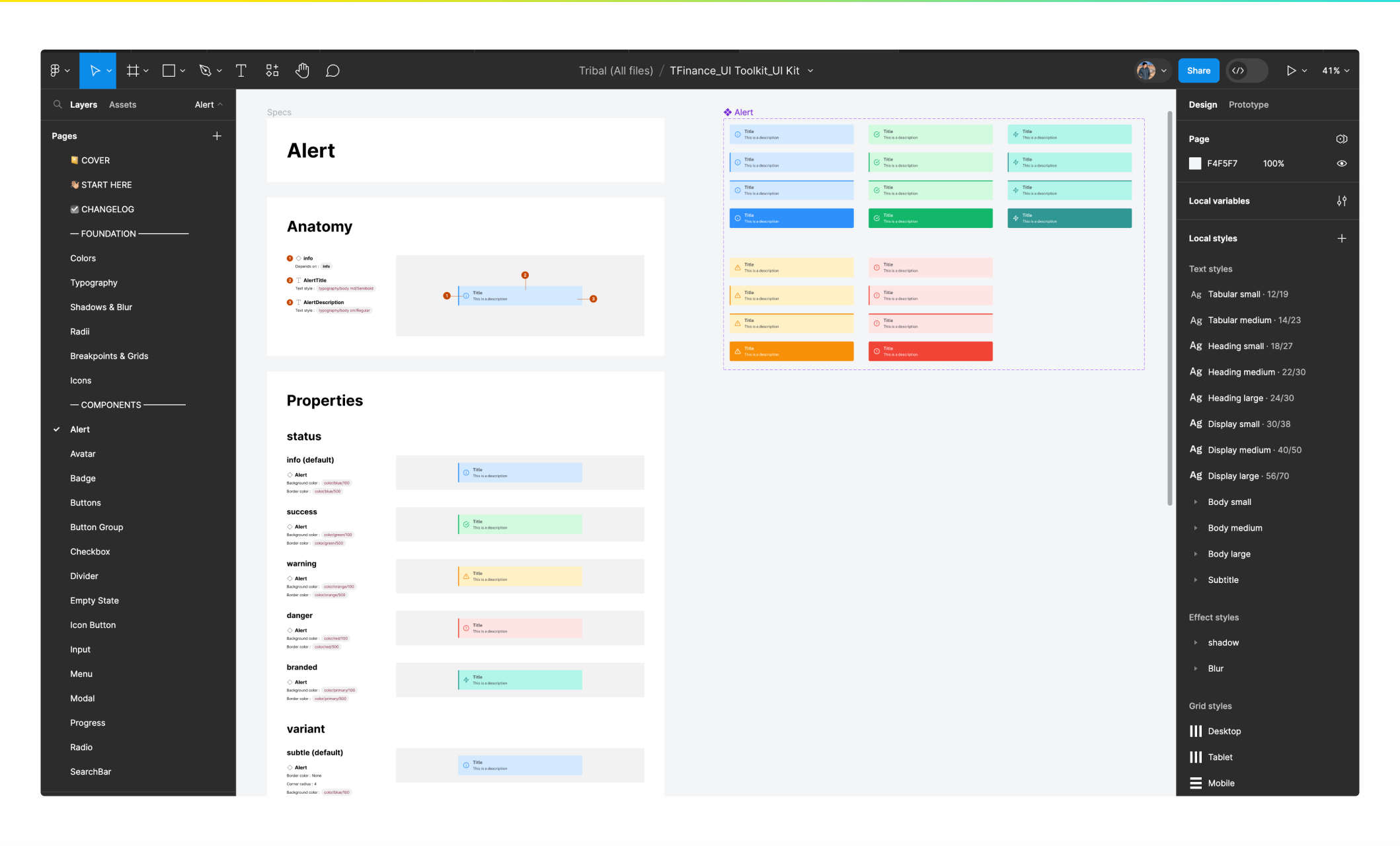
I worked with the team on creating and implementing the design system. The UI kit documents alert anatomy, status colors, and subtle and solid variants alongside the component library.
Defining these states gave designers a common reference for communicating information, success, warnings, and errors across the interface.
Connecting the introduction to the experience
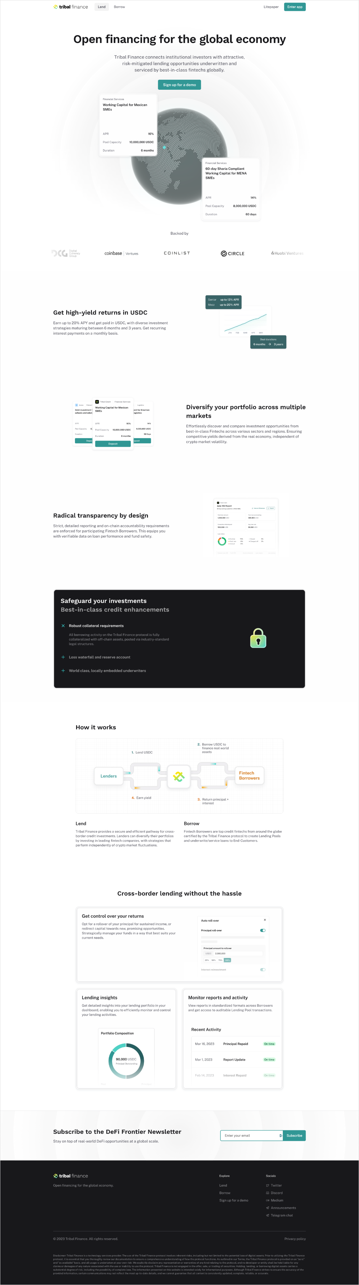
The marketing page introduces lending and borrowing, explains the flow, and presents lending insights. The account views carry that story into balances, earnings, portfolio composition, and activity.
Keeping those surfaces aligned was central to my contribution: helping design and marketing work toward one coherent product experience.
◆Decisions
The decision
Develop the brand and product within a shared design language.
The tradeoff
Marketing needed room to explain the offering, while account screens needed to make financial information easy to scan.
The consequence
A common identity and component system connected the landing page with the mobile and desktop account views.
Product designDesign systemsBrand alignmentDeFiFintech