Tribal Credit / Reporting & data visualization
Tribal Reports: from V1 to V2
Before and after
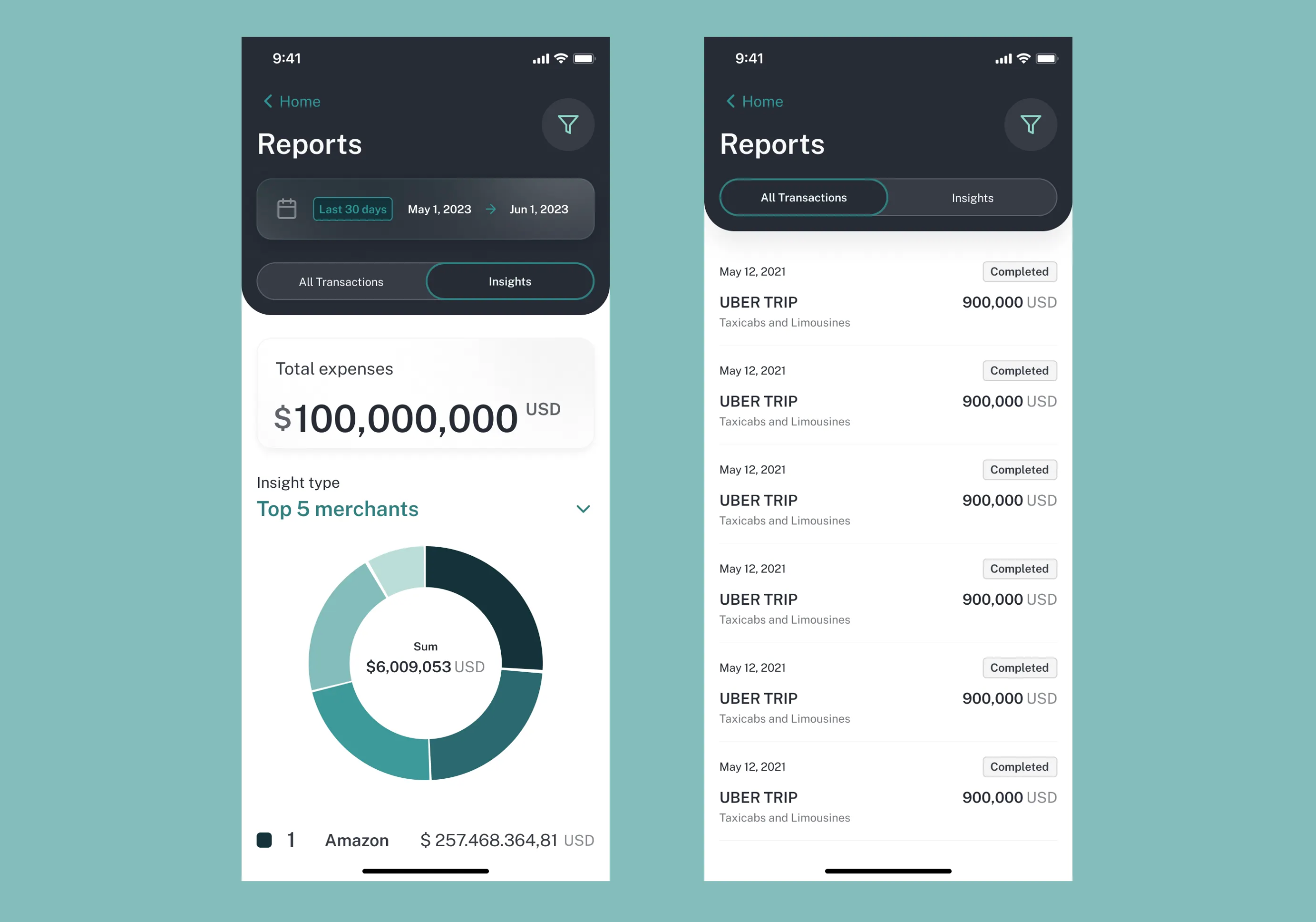
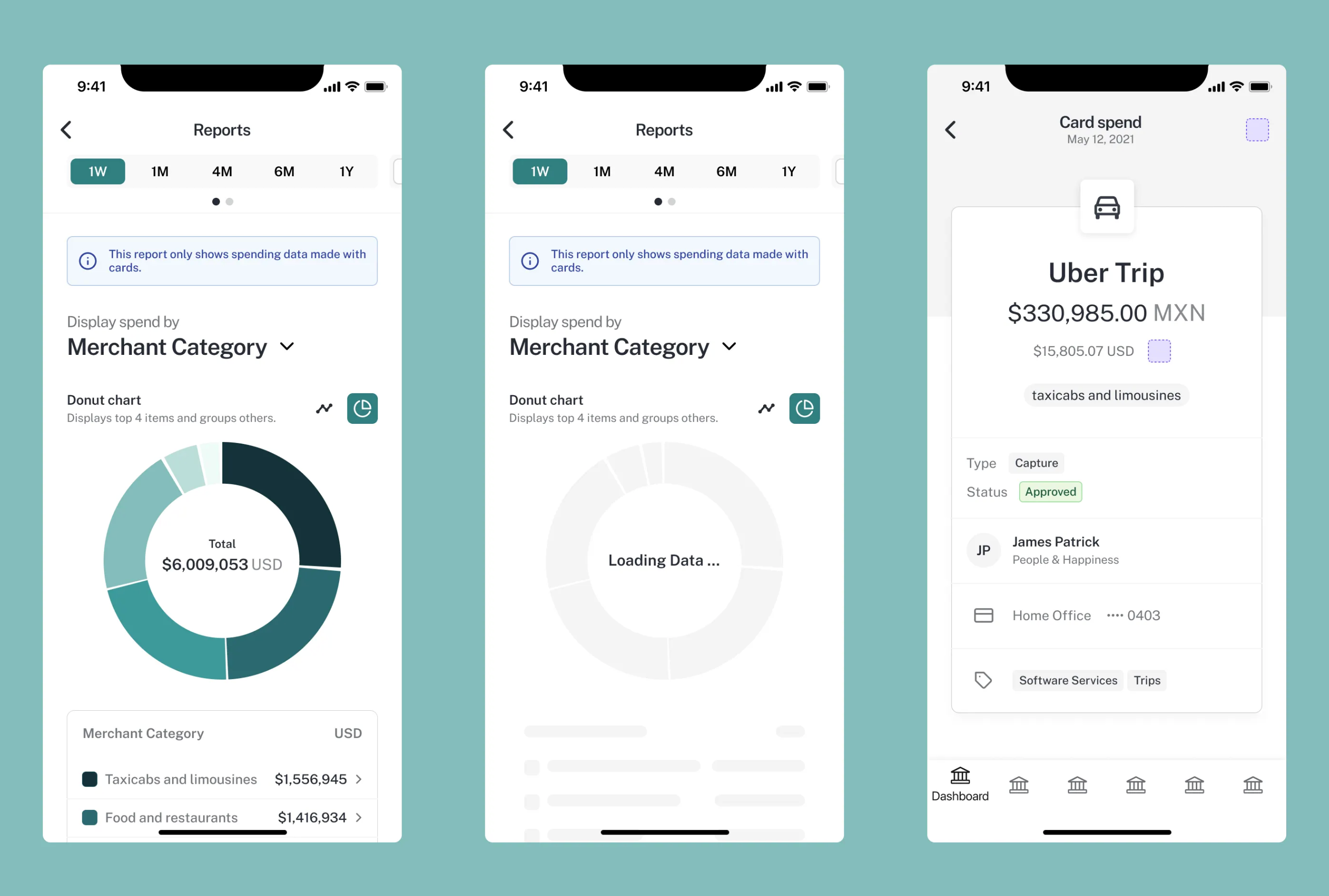
Drag to compare. Arrow keys work when the control is focused.
BeforeThe original Reports design, showing spending by merchant category, the chart's loading state, and a transaction detail view.Open full-size image
AfterV2 brings the updated design system to Reports: a shared header, date controls, and distinct Insights and All Transactions views.Open full-size image
I designed Tribal Reports to make spending data easier to navigate across mobile and web. When Tribal's design system evolved, I refined the reporting experience for V2 while preserving its core functionality. The mobile screens below show that progression.
Result
Carried Reports from its initial design into V2, applying the updated design system to spending insights, transaction lists, and supporting states.
- Year
- 2020–23
- My scope
- I designed the initial vision for Tribal Reports across mobile and web, then updated the experience to Tribal's V2 design system.
The original reporting flow in motion
An 18-second silent walkthrough of the V1 mobile prototype: explore spending by merchant category, choose a date range, and drill into All Transactions.
Open demo videoMaking spending data easier to explore
The initial challenge was to make complex reporting approachable on both mobile and web. I designed an interface that let users choose a time period, explore spending by category, and move from an overview into transaction details.
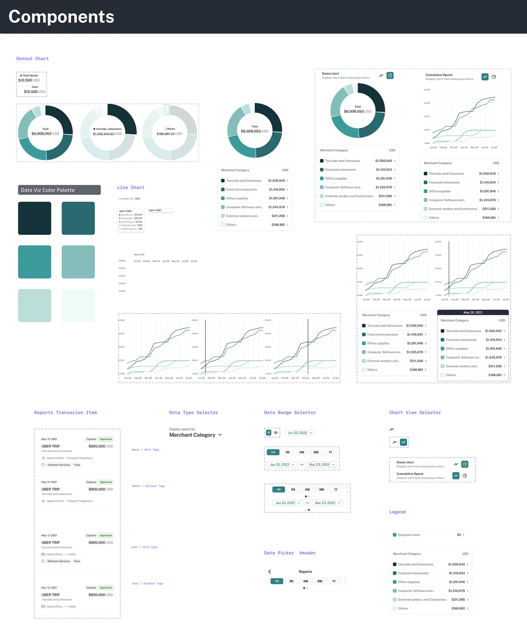
The component work brought together donut and line charts, a shared data-visualization palette, date selectors, legends, and transaction rows. Loading and selection states were part of the design, so the experience extended beyond a single populated report.
Refining the experience for V2
V2 needed to adopt the updated design system without losing the reporting functionality. I refined the visual hierarchy and layout around date ranges, filters, spending totals, and the switch between Insights and All Transactions.
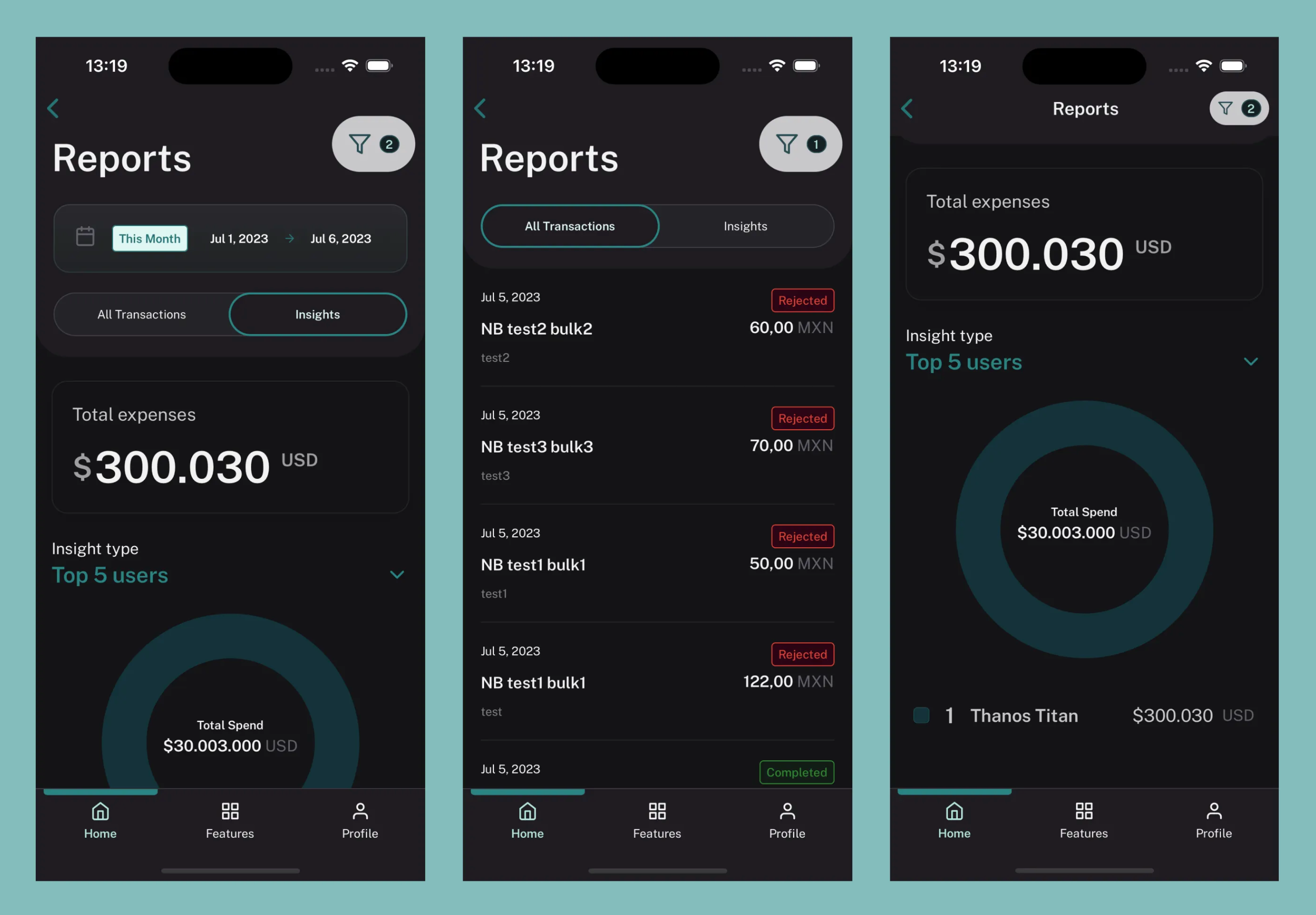
The light and dark mobile designs show how those patterns carry across different presentation modes. Updating Reports meant applying the system to the whole experience: chart summaries, transaction status, navigation, and the controls people use to narrow their view.
◆Decisions
The decision
Use the V2 design system to refine the existing reporting experience.
The tradeoff
The visual language needed to evolve while preserving the reporting tasks and functionality from the first version.
The consequence
Spending insights and transaction views adopted shared patterns for hierarchy, navigation, filters, and status.
Product designData visualizationDesign systemsResponsive designMobileFintech